Dashboard
Dashboard statistics are used to give managers and users a comprehensive reporting location for volumes-generated using client software. To view dashboard, go to .
It allows for quick graphical environment that can be split into Pie Charts, Bar Graphs, or Spreadsheet tables. Statistics are calculated nightly and are accurate to within 24 hours. When analyzing statistics using Dashboards, you will notice the ability to filter and tweak the searches to recover volumes to suit nearly any situation. Scheduled Reports feature allows for reports to be generated at specific intervals and emailed to desired recipients automatically.
Adjusting Dashboard View
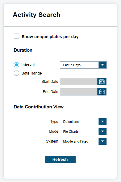
When selecting Dashboard view, you must consider the Duration and whether it should be based on an Interval or a Period. When selecting Interval, you will notice that options range from Last 1 Day to Last 90 Days, All Time, and many other Interval options. When selecting Period, you will be presented with the option to select Start Date and End Date. You also can select the date by using the calendar tool.
The Data Contribution View allows you to set the Type, Mode, and System. For Type, you can choose between Detections or hits. For Mode, you can choose between Pie Charts, Bar Graphs, or Data View. The Data View lists the statistics under each system and user for the dates selected. Lastly, the System option will allow you to choose between Mobile, Fixed, or Mobile and Fixed system types.
Filtering View
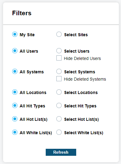
Beyond Activity Search, you also has the ability to control filters for Site, User, System, and Hot Lists. You are able to turn off individual filter components by simply unchecking each Site, User, System, or Hot List listed.
The lists will be dynamically updated based on new components being added. When a Site Share occurs, you will be able to view their Detections from users and Systems, and/or view Hot Lists sources that were shared. When using Filters for Data Contribution Type-hits, you will be presented with additional Alert Type filter options for each Hot List Source. From these filters, the system is capable of defining which detections or hits are viewable in the display.
Viewing Dashboard Statistics
For Mode, there are three statistics views, which are Pie Charts, Bar Graphs, or Data View.
Pie Charts
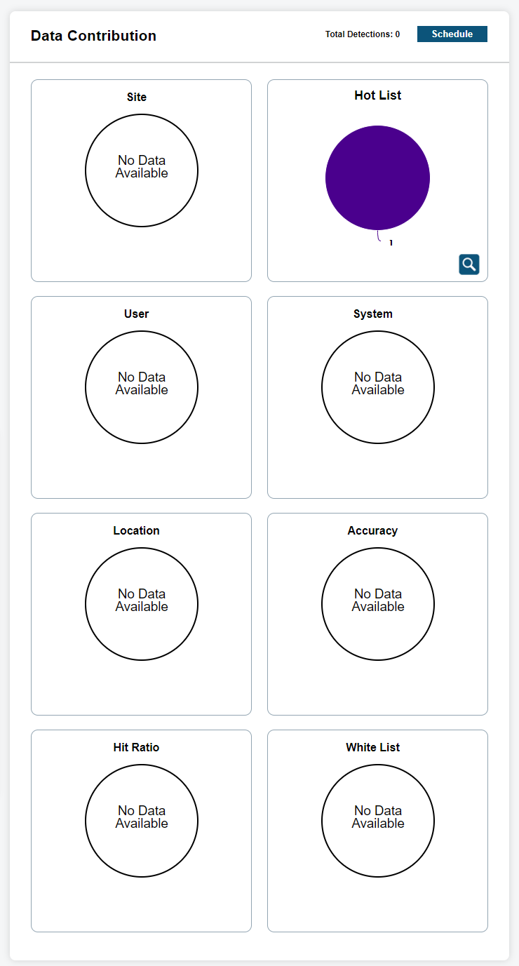
When viewing Dashboard Statistics using Pie Charts mode for type Detections, the following data will be presented:
- Site
- Displays detection ratios from each site that are currently within the system user data pool and within the chosen Duration.
- Hot List
- Displays the Hot List ratios of all available Hot Lists within the managers data pool. This will include shared hot lists.
- User
- Displays detection ratios for each user selected from each site available.
- System
- Displays detection ratios for each system selected from each site available.
- Accuracy
- Displays the ratio of Correct, Incorrect, and Not Scored hits.
- Hit Ratio
- Display the ratio of detections against hits.
When viewing Dashboard Statistics using Pie Charts mode for type Hits, the following data will be presented:
- Site
- Displays detection ratios from each site that are currently within the system user data pool and within the chosen Duration.
- User
- Displays hit ratios for each user selected from each site available.
- Hits by Source
- Displays the ratio of hits for each Hot List Source.
- Hit Ratio
- Display the ratio of detections against hits.
- Alert Types by Source
- Displays the ratio of hits for each Alert Type within the Hot List. Each Hot List Source available, will be listed with Alert Type ratios.
When displaying the Pie Chart, you can hover over each piece and view the corresponding statistics in a bubble overview. For some pie statistics, they will be batched together if the ratio is too small to distinguish a ratio. In this case, you will see the first and last key separated by hyphen. By clicking on the magnifying glass, you will be presented with a Dashboards Detail view. This allows for a detailed table with key, ratio descriptions, and counts. Within the Detail view, there is an option to Output Report to a PDF format. The report will include current view of Pie Chart and Table.
Bar Graphs
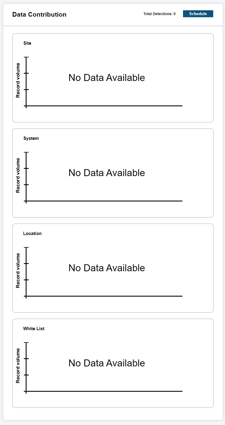
When viewing Dashboard Statistics using Bar Charts mode for type Detections, the following data will be presented:
- Site
- Displays detection ratios from each site that are currently within the system user data pool and within the chosen duration.
- Hot List
- Displays the Hot List ratios of all available Hot Lists within the managers data pool. This will include shared hot lists.
- User
- Displays detection ratios for each user selected from each site available.
- System
- Displays detection ratios for each system selected from each site available.
When viewing Dashboard Statistics using Bar Charts mode for type Hits, the following data will be presented:
- Site
- Displays detection ratios from each site that are currently within the system user data pool and within the chosen Duration.
- User
- Displays hit ratios for each user selected from each site available.
- Hits by Source
- Displays the ratio of hits for each Hot List Source.
- Hit Ratio
- Display the ratio of detections against hits.
- Alert Types by Source
- Displays the ratio of hits for each Alert Type within the Hot List. Each Hot List source available, will be listed with Alert Type ratios.
When displaying the Bar Graph, you can hover over each bar and view the corresponding statistics in a bubble overview. For some bar statistics, they will be batched together if the amounts are too small to distinguish between the other elements. In this case, you will see the first and last key separated by hyphen. By clicking on the magnifying glass, you will be presented with a Dashboards Detail view. This allows for a detailed table with key, element descriptions, and counts. Within the Detail view, there is an option to Output Report to a PDF format. The report will include current view of Bar Graph and Table.
Data View
When viewing Dashboard Statistics using Data View mode for type Detections, you will be presented with a default table that shows the Time Period, Users, Total Detections, and Total Hits. Just like with Pie Charts and Bar Graphs modes, the system can control the Site, User, System, and Hot List filters to control the table output. When viewing Dashboard Statistics using Data View mode for type hits, you will be presented with a default table that shows the Time Period, Users, and Total hits. Just like with Pie Charts and Bar Graphs modes, the system can control the Site, User, Hot List, and Alert Types for each Hot List using the filters to control the table output.
To Output Report, the table should be populated with data, and you can select Output Report. You will be prompted to save the Excel file using the GET XLS button to a location on your local drive. The default name will be based on the Type and date of the report. You can rename the file to something more descriptive. You will want to open the report using Microsoft Excel or compatible program for XLS.
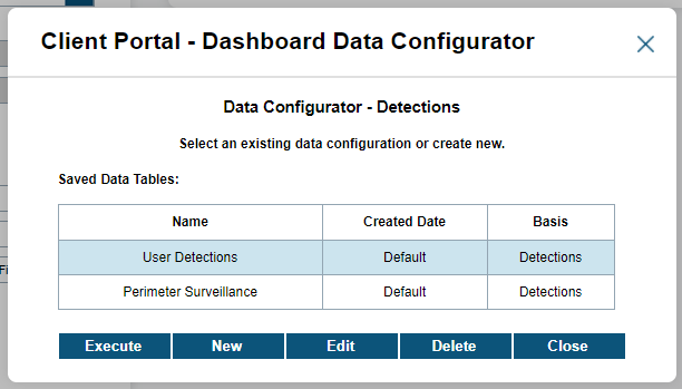
To Configure the table to output different X-axis and Y-axis fields, you can select the Configure button. You will be presented with Saved Tables, which will state the Name, Created Date, and Basis. The Basis is dictated by the Type that was originally selected in the Data Contribution View selection (Detections or hits). The Default table is uneditable, and you will want to select New to create a new Table View. Once a new table has been configured, you can Edit or Delete the Table View. Also, you can Execute the search of the saved Table View.
The Data Configurator - Detections will allow you to configure the X-Axis for users, Site, or Systems. You can also configure the Y-Axis for different periods (Daily, Weekly, Monthly, and so on). You also have the option to Swap Arrangement by clicking on the Swap button. This will invert your X-Axis with your Y-Axis. To save your Table View configuration for future use, click Save and enter the name of the table. Your Table View will instantly populate the table. If you wish to execute without saving, you can simply click Execute, and the table will populate with desired output.
The Data Configurator - Hits will allow you to configure the X-Axis for users or Hot List Source. You can also configure the Y-Axis for Hot List hits or Total hits. When choosing Total hits, you will be prompted select period for hit data (Daily, Weekly, Monthly, and so on).
Scheduling Reports
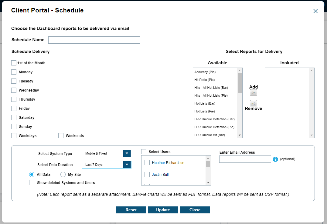
By selecting the Schedule button below the Data Contribution header, you will be presented with an extensive scheduling option. You can select which days of the week to distribute report by Email under the Schedule Delivery header. For each day of the week, you can edit up to three times to receive a message per day. Currently, these times are listed in EST time-zone.
Once the schedule has been selected, you can configure the Select Reports for Delivery. The left column will list the Available reports while the right column will show the Included reports. To add or remove reports, simply highlight the desired report and click Add or Remove button. Lastly, you will need to specify the System Type and Data Duration. Finally, while setting up scheduled reports by email, you will be prompted to input an email address for the recipient of the report. Multiple email addresses can be entered and separated by a semicolon. Once the changes are complete, select Update to save your changes and Start to begin receiving the Scheduled Reports.